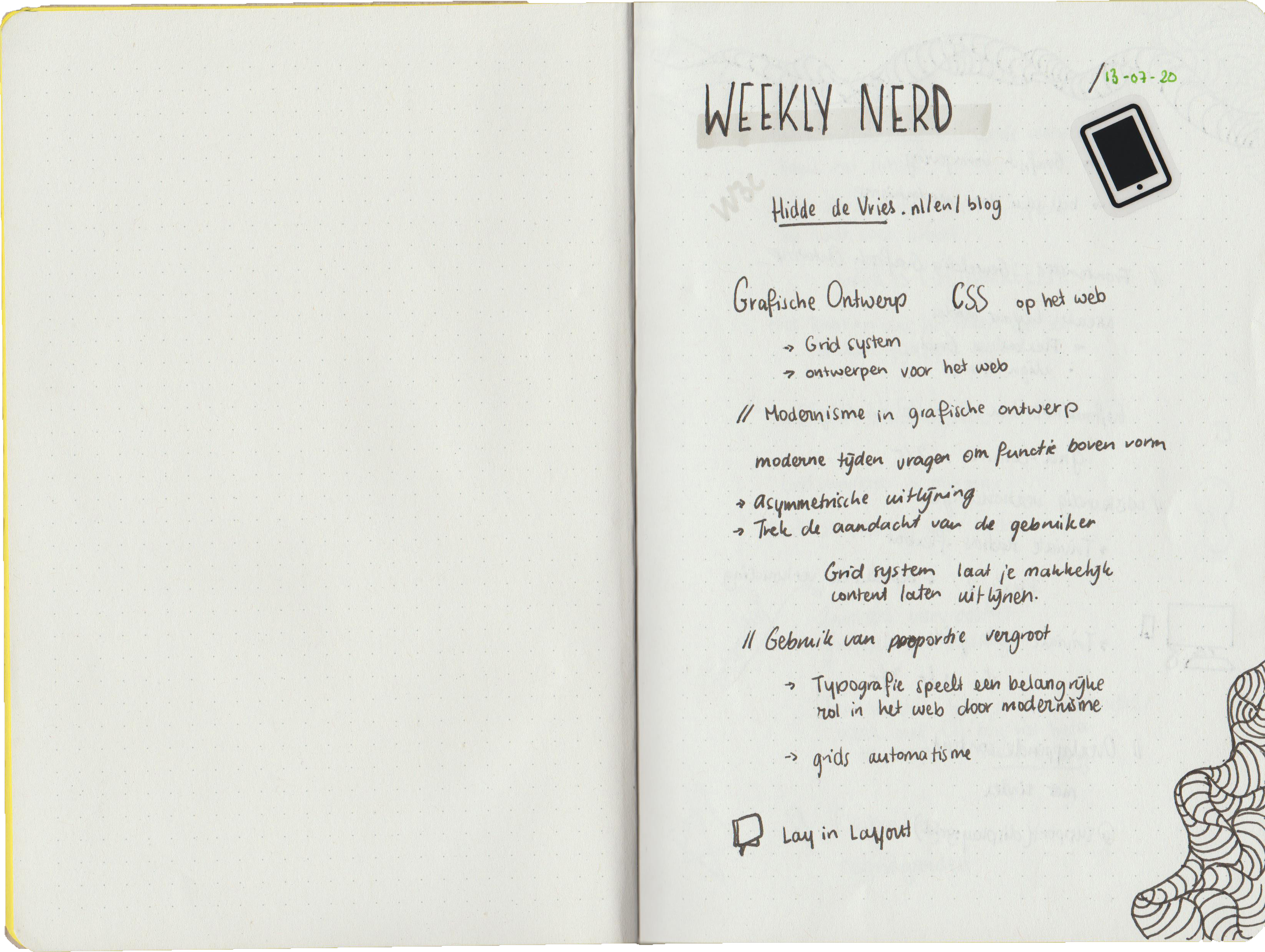
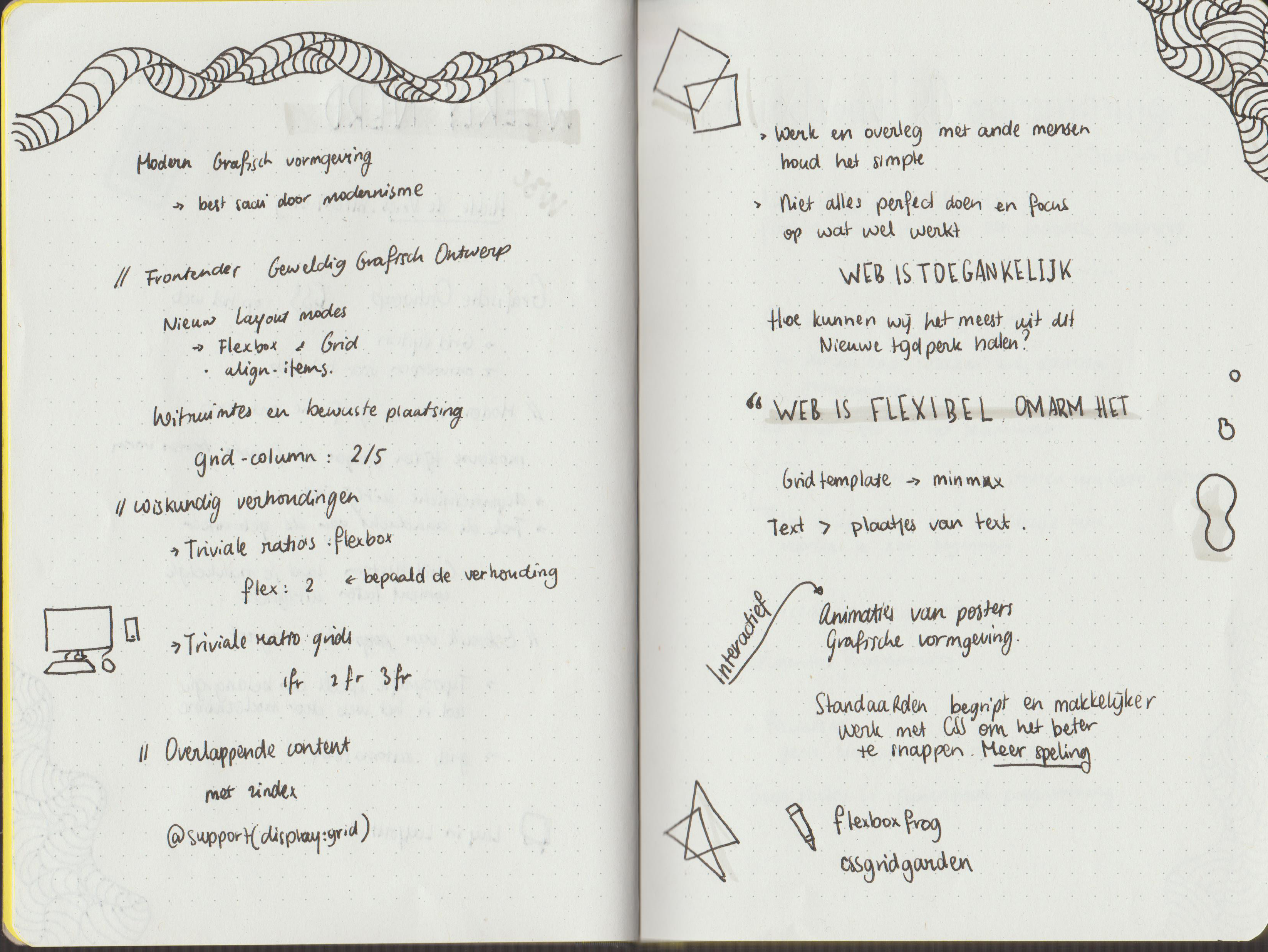
A presentaion from Hidde about the web and how web contantly changes. With a short explanation about css and the use of Grid and Flexbox.
- Grid system
- Design for the web
- Flexbox
Modernism in graphic design. Modern time are placing functions above the shape. To catch the users attention, a good use of assymtrict alignment would be the case. And the easiest way to create this are making use of the Grid system The web is accessible for a lot of user. At this point bigger typography can be big role of this new era. Each design are more likely to look the same because your creating a design for everybody. And grid is creating a more automated design.
Boring
But where is the peronality on each webdesign? Well, those are practically gone, because of the reason mentioned above. As a big company you want a big audience, losing some design and creating for everybody is one of the main reason why a lot of webdesign are the same. Just like the Bijenkorf lost their typography and went for a minimalistic look.
Frontender
The web is art, you can create every design with it as far as your designing skill goes. CSS is wonderful tool to express the design and creation you want. But keep in mind that it has to be accessible. You want to tell a story, bring content forward and create a great experience. So because of the web is evolving, we as frontender needs to evolve with it. Create system, where you get to see content as easy as possible. Before Flexbox there was Grid, Grid was a lot of work and Flexbox, just made everything a lot easier. The ones who created Flexbox where absolute Nerds. This came from a lot of calculus and well I can tell you, I have no idea how they this. Anyways, very thankfull for it.
Web is flexibel, embrace it.
Content and workflow
Grid are being maintained by a small group of people but they are not getting enough feedback from the outside world. They don't really know what's happening and which cases are used with the grid. The people don't actually know there is a whole support group behind it. But if you have questions about grid, ask them. They would loved to hear some feedback. The work that you do, has to be simple, communicate what you want with the design. Which content needs to be adressed and why, Frontenders tend to always go for the perfect design, but a good design often comes from a lot of iteration and feedback. Focus on the necessary parts of the web and create an easy flow to get to the end goal.
Interaction
Graphic design is actually the same as Frontend. The web is your canvas, and you can create
interaction with your canvas.
Posters are not flexible, or interactive. You see a design and that's is it. But because of the
web
we can give the design life.
A life to be interacted with, to be more than just a design. The user will then remember it more
and
the design will have
more purpose.
Get rid of the standards and create something amazing.

